Role: Information Architect & Visual Designer
Sprint: 2.5 weeks
Design Team:
Gabriella Oliveira: Interaction Designer
Kendall Graham: Project Manager & UX Researcher

Overview
We had the wonderful opportunity to work with Stuart Gordon: an UXDI grad, Sound Family Medicine designer and client for this project. In this project, I was able to really practice and hone my UX/UI design skills and explore the medical industry while having fun designing and solving the frustrating onboarding process involving potential and new patients.
About Sound Family Medicine
Sound Family Medicine is the largest independent, physician-owned practice in East Pierce County. For 35 years, they have cared for the East Pierce community through maternity, pediatric, internal-medicine, and walk-in care services. They have a total of 4 clinics (3 in Puyallup, 1 in Bonney Lake).
The company is patient-focused, striving to provide the best family medical care to their patients. Their unique culture stems from the clinics’ providers furnishing pre-natal care, delivering newborns, teens, adults, and grandparents well into the 90s.
Design Problem & Focus
Problem:
The current site was built about 5 years ago without the aid of UX design and had become inefficient. Their users complain they can’t find what they’re looking for and end up calling patient services or leaving the website all together.
Focus:
• Revamp information architecture of the current sitemap
• Design focus on onboarding new patients
• Explore a separate experience for current patients
• Improve and reduce content overload
• Focus on simple and intuitive design
Research
Understanding the Problem
In our initial meeting with the client, we discussed the design brief he provided and explored some of the challenges the clinic website faces from a user perspective. Our team took these insights and broke the problem into segments to help us understand and prioritize the details.
Research & Brainstorming
After synthesizing the design brief and problems, I began a competitive analysis of medical clinic websites. I wanted to get a better understanding of how the medical industry targets new patients and to gather insights on trend/design styles currently being done in this industry. As the informational architect, I also kept in mind website structure and hierarchy. This research was necessary to start visualizing how to differentiate Sound Family Medicine’s brand from the existing market and to create a unique flow that improves the user experience.
Persona
To further inform the design process, our researcher took insights gathered from stakeholder interviews and SFM staff surveys to create our user persona, Krista. Krista embodies the type of user we want to solve for, which includes the user story, frustrations, needs and traits. Krista guided my design process and provided our team a visual representation of the problem we were trying to solve.
Persona made by Kendall Graham
Problem Statement:
Krista needs a way to trust her new doctor enough to make an appointment for her son because she has lost trust in her current doctor with his.
Hypothesis:
We believe that by removing convoluted vocabulary and simplifying the onboarding process, we will achieve transparency and build trust faster with for new patients.
Ideation
Flow & Structure
The next stage of the process was to define the flow, layout, and structure of the website. Based on the research both our team and the client had done, current users had difficulty finding the information they needed on the website, so we explored this.
Sitemap
Here is the current sitemap as it is today:

It was found that it wasn’t how many categories (menu items) there was that was the problem, it was the content overload that was in each page that was frustrating users. It was a task that our team could explore further, but given the 2-week timeframe given for this project, I focused my efforts towards how we could instead make key information easier to find.
In order to understand how people navigate the website’s top-level navigation menu and think about content, I conducted open cards sorts with 5 users. The takeaways from these sorts included:
-Users sorted 26 menu items into five categories: About, Providers/Staff, Payment/Bills, and Services
-Largest category was Services, with 11 items.
-It turned out users categorized services with resources under one umbrella.

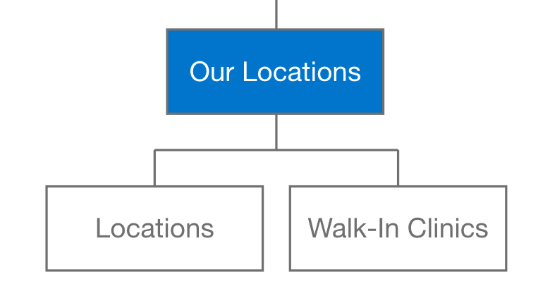
This analysis led me to create a new top-level menu category: Resources. The sitemap prioritizes key information, first, and supplementary information, secondary. Thus, providing Krista the ability to find the information she needs easily and quickly, boosting her need for trust in her clinic. Below, is the redeveloped sitemap for SFM, based on Krista’s needs.

Visual Design
From Wireframes to Hi-fi
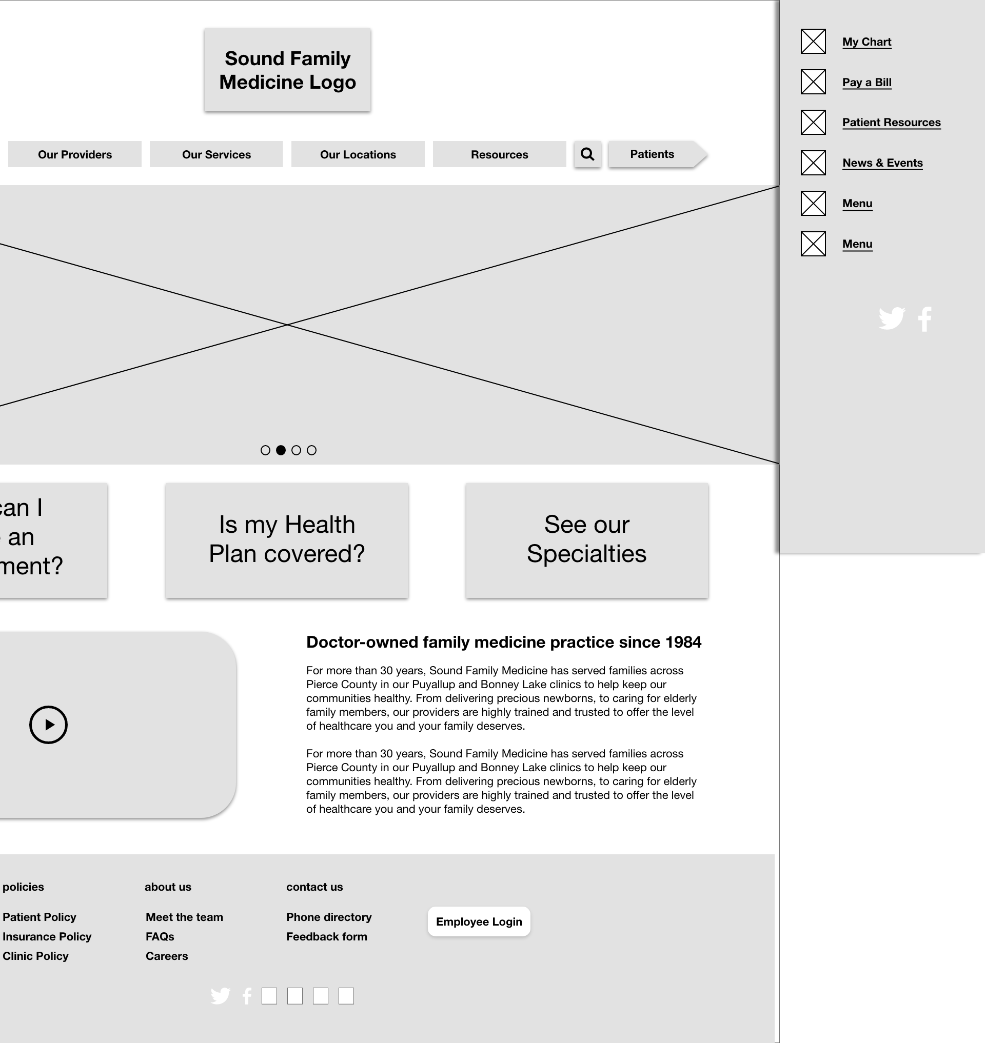
The final phase of my design process was to turn wireframes into hi-fi mockups. I took the final iterations of the wireframes created by the team’s interaction designer, Gabriella Oliveira, and added color and style to what was created.


Style Guide
Our client provided our team with an extensive brand guidelines deck that was instrumental in my visual design process.

Battle of the Headers
In designing the header of the landing page, a challenge came up in regards to the placement of the menu bar. To validate which design was more user-friendly–in
terms of aesthetics and visual hierarchy, I conducted an AB test showing 10 users
both versions of the header and considered their feedback. Version B won by a landslide, 8-2.
Version A

Version B

High-fidelity Designs
Landing Page


Provider Page


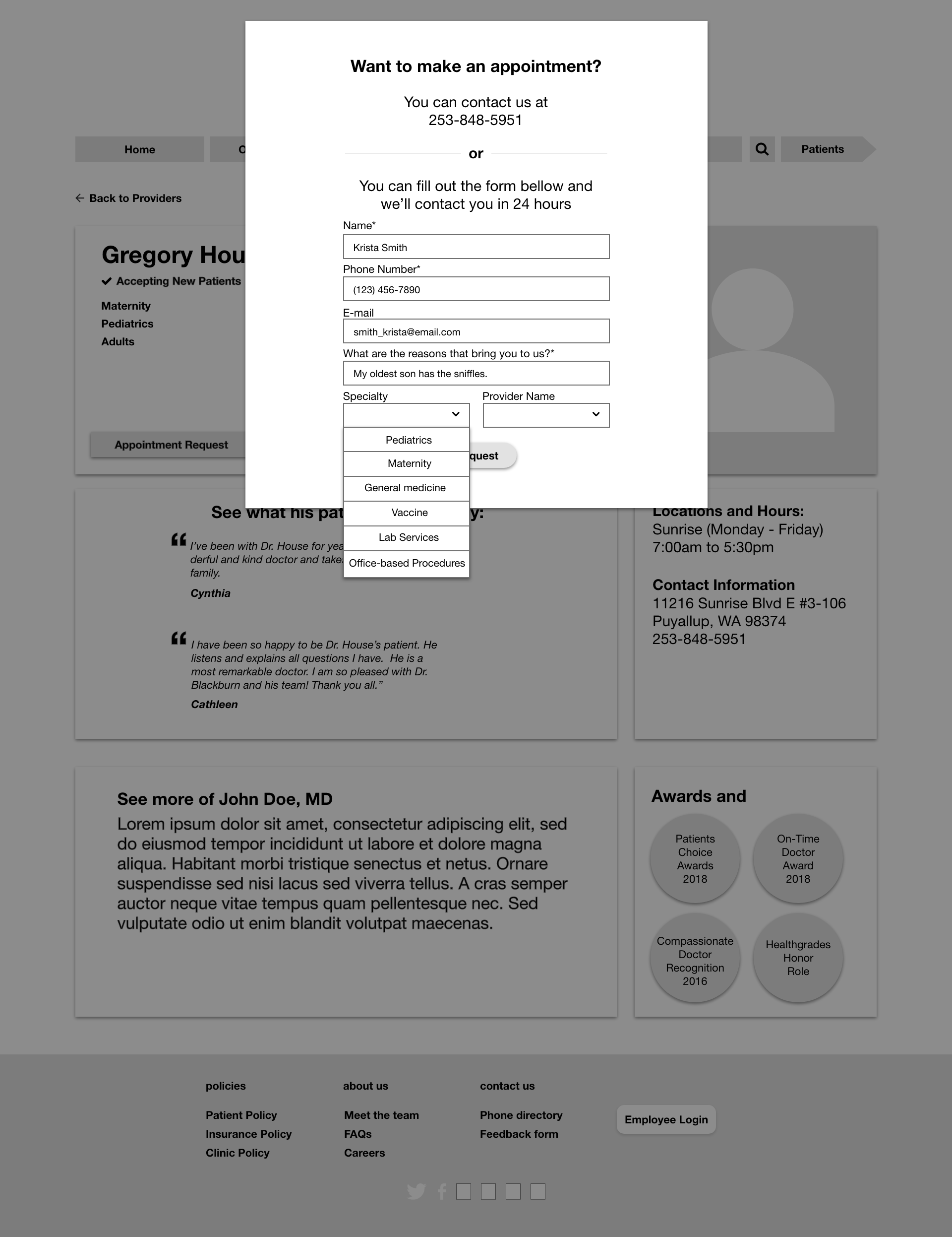
Appointment Request


Prototype
Scenario
Krista is looking for a doctor for her son, who has the sniffles. Her friend told her that she should check out, Sound family Medicine. She explores the website and is impressed with the company’s vibrant history and transparency. Krista then uses the nifty filter function on the Provider’s page to look for the best doctor she can for her son. After she chooses Dr. Jeung, Krista ends her journey by completing the appointment request form.
Conclusion
Did we help Krista? Our users sure think so. 100% of users tested responded that their experience with the design was easy and intuitive. New patients now make appointments in just 3 clicks.
Next steps
• Begin research on current patient pain points and goals
• Test “request appointment” function with the SFM front desk
• Research and explore adding an accessibility feature
• Begin designing mobile responsive web layout.
What I learned
This was my first project working with a client. I was fortunate enough to have a client who was a collaborator with us. He knew the overall design process and both he and our team were able to communicate effectively. He thoroughly enjoyed our designs and he is working with the company to have our team present our findings to their executives (I’m looking forward to it!).
I was also very fortunate to have a wonderful and encouraging team. Kendall and Gabriella are both talented designers and I am grateful to work with them on this project.


