Role: Full-Stack UX Designer
Sprint: 2 Weeks
Overview
During my time as a General Assembly UX Design Immersive student, I worked through the UX design process from user research to mid-fidelity mockups over two weeks to redesign MacPherson Leather Company’s website, focusing on the eCommerce system.
About MacPherson
MacPherson Leather Company was established in the early 1900s and continues to run as a multi-generational family business. The business prides themselves for excellent service and expertise, and are locally recognized for their quality of goods.
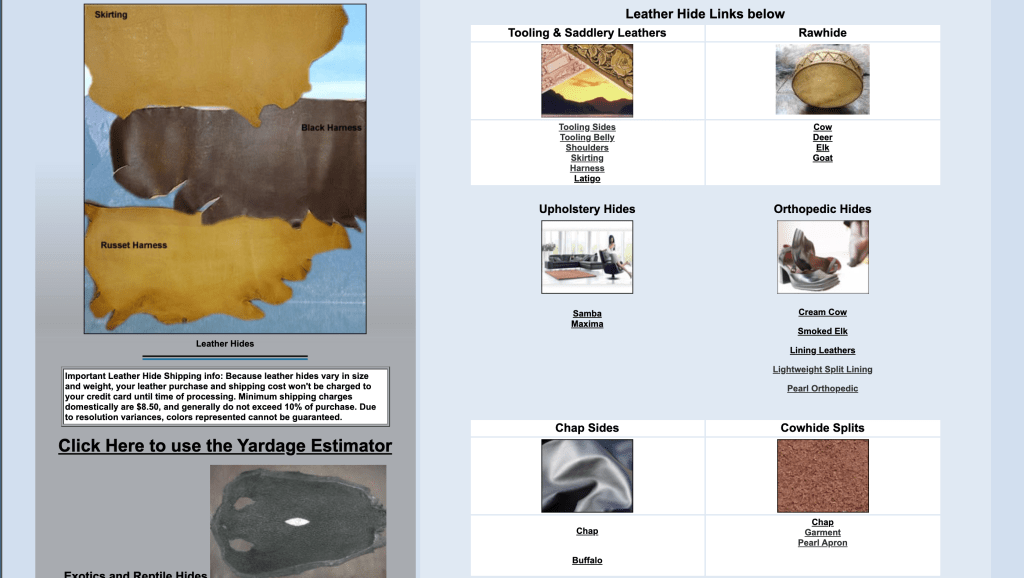
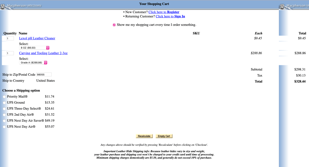
The operators recognize that the website is weak due to the lack of updates. As a customer of the business myself, I also struggle to navigate through the site and payment options.

Research
Persona
Meet Lauren…

In this project, I was designing for Lauren Berlinger, a young technologically-native copywriter who is a big fan of ‘retro-chic’ and makes purchases on the web regularly. Designing for Lauren guided my design process and influenced the way I approached this project.
Problem Statement
Laurent needs a way to easily navigate the website and feel empowered to make a purchase quickly because she feels that the current MacPherson website is complex and takes too much time to checkout.
Design Goals
Based on my research and Lauren’s pain points and goals, I created several design goals that helped keep me grounded throughout the project:
•Easy to navigate menu bar
•Create a seamless eCommerce experience
•Including Apple Pay to simplify the checkout process
•Large product tiles and quick view
•Eye-catching carousel
Ideation
Information Architecture
Card Sort
In order to understand how users find products on the website, I did an open card sort with 5 users.
In this exercise, I learned how users categorized items and what types of products went into each category.

Sitemap
Using what I learned from the card sort as part of my reasoning for my navigation menu, I designed and proposed a new sitemap while also keeping Lauren in mind.

Task Flow:
In order to test the flow of my design, I created a scenario where Lauren would use the website to purchase an item. The task flow helped me visualize the process it takes to go through the single task and streamline navigation across the process.

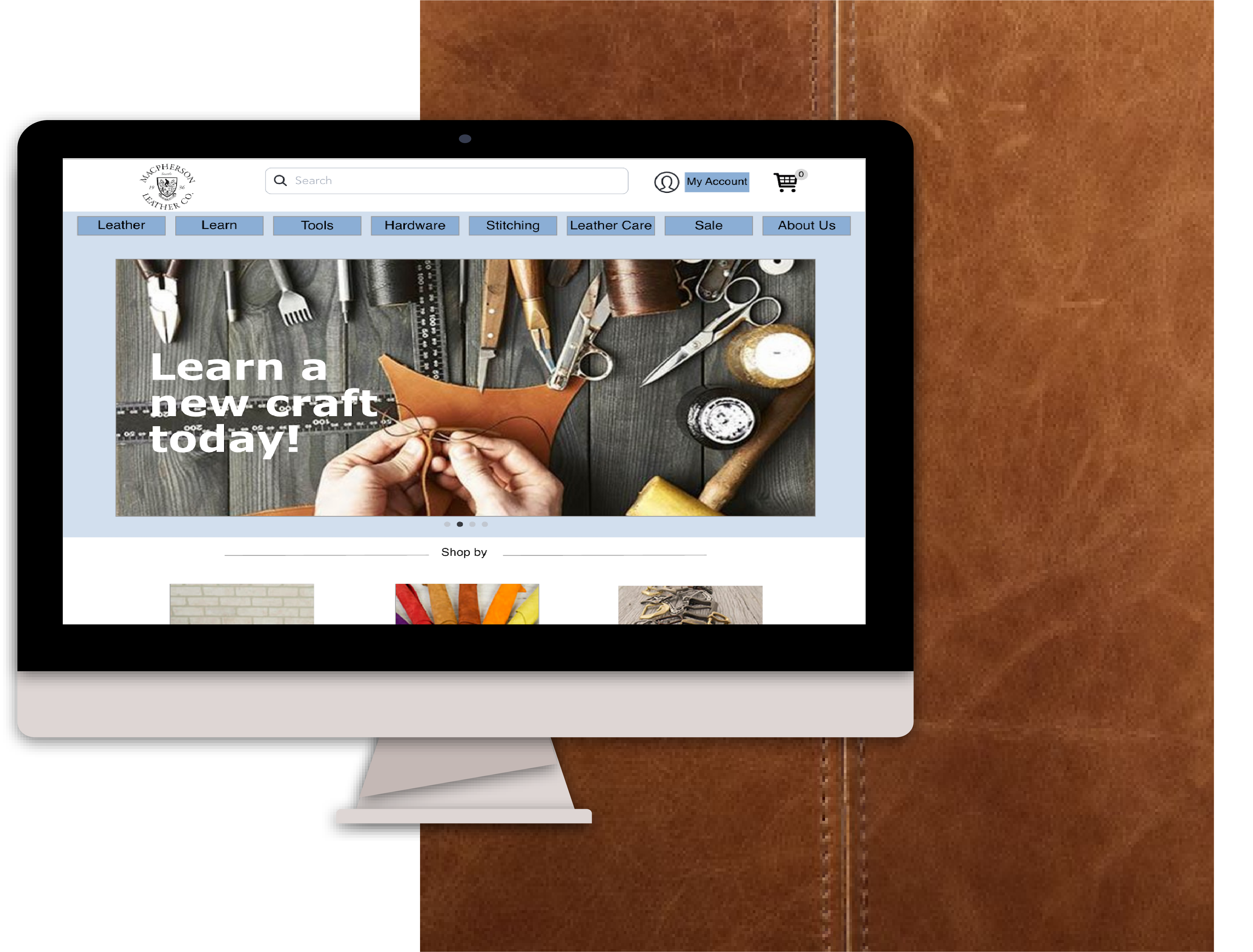
Design
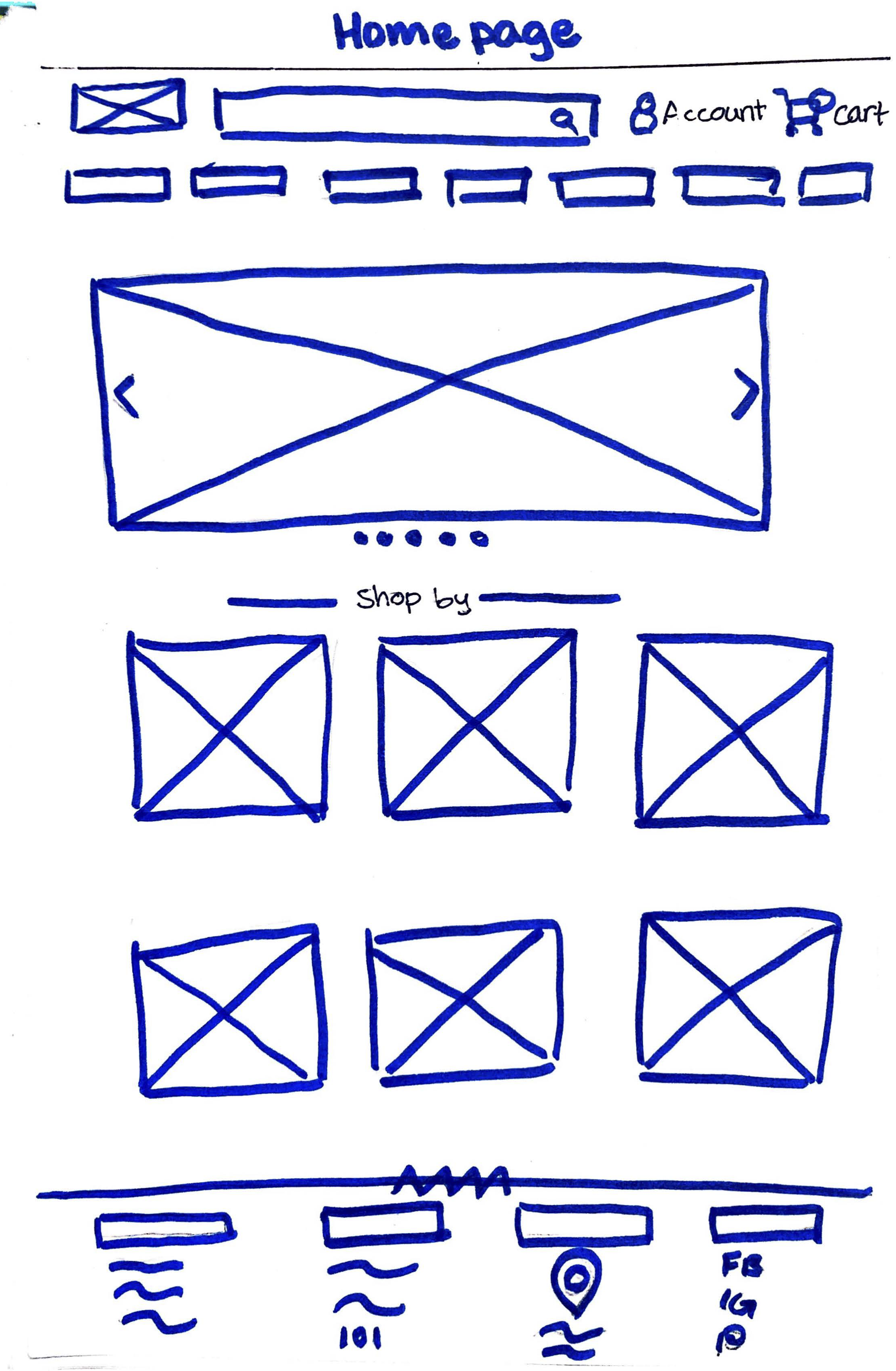
Sketches
The next step in my process was to start sketching out ideas of how the pages of the website might look like. These sketches were based on my research on both competitive and comparative websites as well as incorporating Lauren’s needs and goals.

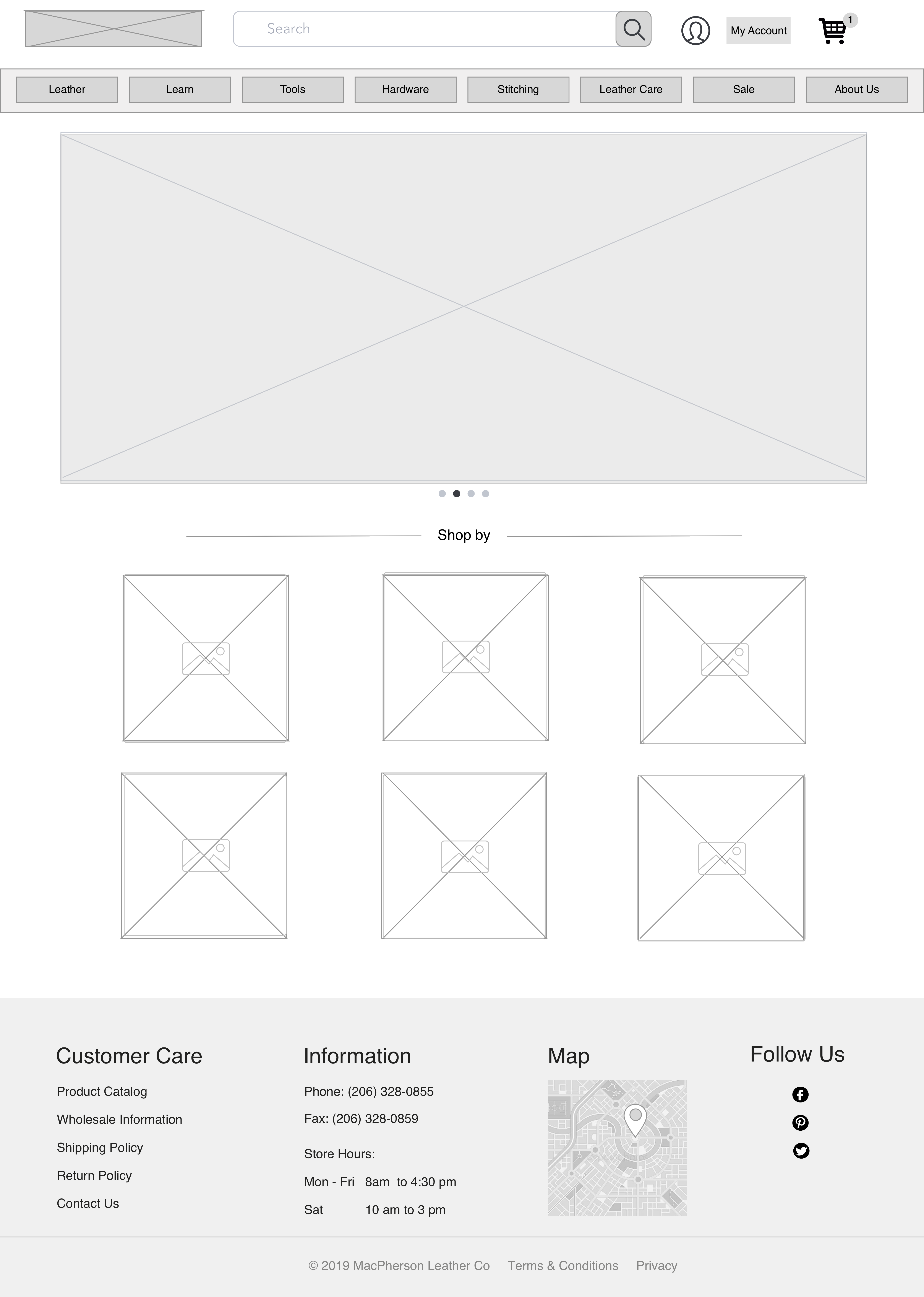
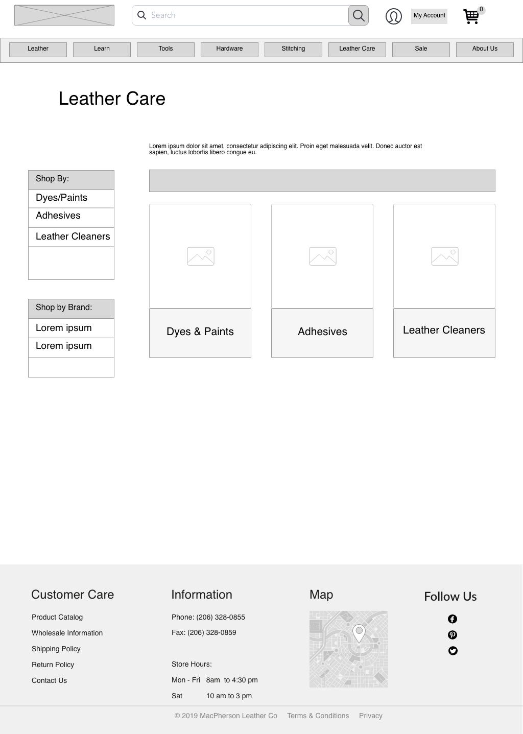
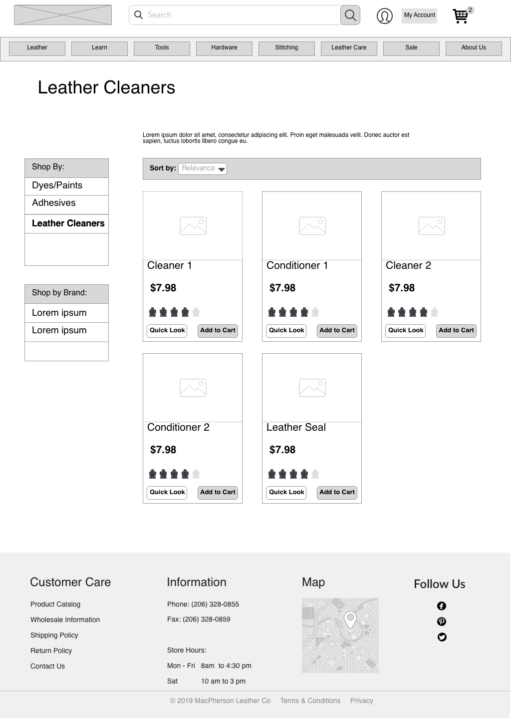
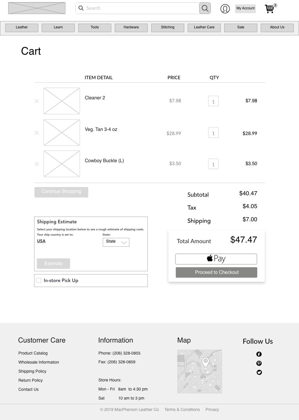
Wireframes
When I was comfortable with the ideation I made in sketching, I created digital wireframes of the pages I needed for Lauren’s user task flow. These pages included: Landing Page, Leather Care, Leather Cleaners, Cart,and the checkout process.

Usability Testing
Based on 8 usability tests done with other students at General Assembly, users expressed:
•They would like to go back to previous pages during the checkout process by clicking the words: ‘Shipping Address’ and ‘Billing Detail’, instead of clicking the back button
•A confirmation page after checkout would notify users where they can expect their invoice
Prototype
Scenario
Lauren spills coffee on her retro-chic soft leather bag and she knows that water and soap is harmful to leather. She goes to MacPherson Leather Company’s website to pick out a leather cleaner with intent to purchase a cleaner and checkout.
or
play through the prototype yourself!
Conclusion
Next steps
There is always more testing to be done! Had I had more time with this project (we only had two weeks!), I would:
• Create different task flows and conduct usability tests on those.
• Explore hi-fidelity designs for other pages, while incorporating the company’s style guide.
What I learned
This was my first full-stack (research, information architecture, visual designer) UX project. At the time, the design process as a whole was a challenge. Yet, it was a great project to learn and practice the whole design process, plus using the tools that accompany it. It was my first time using Sketch and inVision and by the end of the project, I felt empowered to continue using those tools in future projects.
I also learned to truly think about the user throughout the whole project, rather than my own ideas. In a previous project, I was given the critique to “remove myself from the equation” when designing. I knew then that the insight I received will help me grow into a better designer. Then, I put in practice the disciplines and methodologies we were learning at GA at the time to develop a working mid-fidelity prototype.
This project was also the first time working with a real business. There were design limitations and business processes to put into consideration. For example, I had to be aware that their current website was already being used by the business’ users. What I had thought was disjointed in their design may have been there for a reason. With that, I learned that in everything that I make must have a reason for its design.

Leave a comment